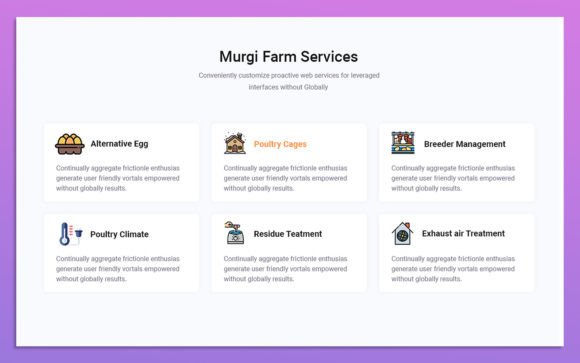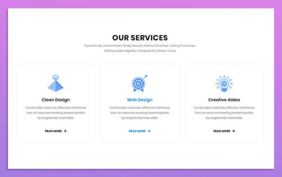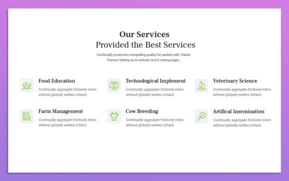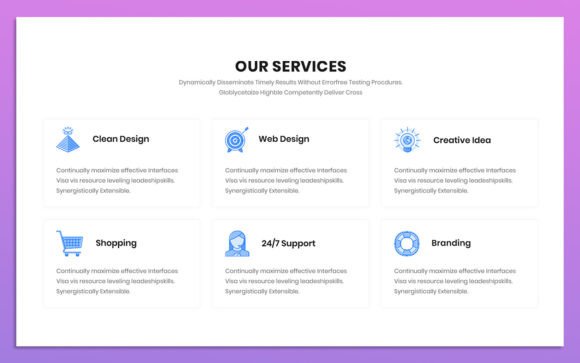
10 Colorful Services UI Elements
Visual communication is the backbone of modern digital interaction. When a potential client lands on your website or opens your application, they form an opinion within milliseconds. This immediate impression is rarely based on text alone; it is driven by layout, spacing, and, most critically, color. The 10 Colorful Services UI Elements pack offers a streamlined solution for designers and business owners who need to present their offerings clearly without starting from scratch. These elements are not just decorative; they are functional components designed to guide user attention and improve conversion rates.
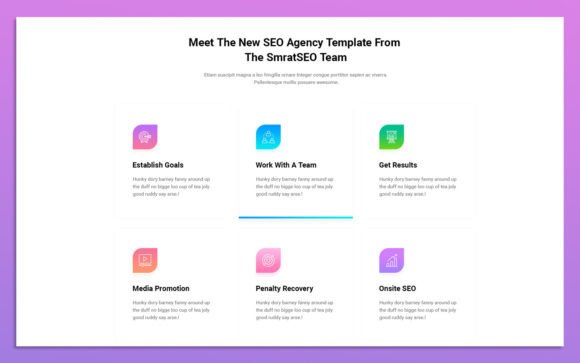
At its core, this resource is a collection of pre-designed interface blocks specifically tailored for service-based layouts. Whether you are showcasing consulting packages, software features, or creative portfolios, these elements provide a structured yet flexible foundation. The design philosophy here is simple: clean lines, modern typography using Google Fonts, and vibrant color schemes that can be easily customized. Because the source files are provided in PSD format with fully organized layers, users retain complete control over every pixel.
Why Visual Clarity Matters for Different Users
The value of high-quality UI elements varies significantly depending on who is using them. For a seasoned graphic designer, time is the most expensive commodity. Spending hours drawing rectangles, aligning icons, and testing color contrasts for a standard services section is an inefficient use of billable hours. For this professional, the 10 Colorful Services UI Elements serve as a rapid prototyping tool. They allow the designer to skip the mundane setup phase and move directly to customization and client presentation. The ability to toggle visibility on organized layers means they can swap out colors to match a brand identity in seconds, not hours.
Conversely, for entrepreneurs and small business owners who may not have deep technical skills in Adobe Photoshop, these elements offer accessibility. The promise of being "very easy to use" is crucial here. A freelancer launching their first portfolio site needs to look professional to compete with larger agencies. They might not know how to construct a complex vector shape, but they can likely change a hex code or replace an icon. This democratization of design quality allows non-designers to achieve a polished look that builds trust with their audience. The RGB color format ensures that what they see on their screen is exactly what will appear on web browsers, avoiding common print-to-web color discrepancies.
Evaluating Flexibility and Customization
One of the primary concerns when adopting pre-made assets is flexibility. Will these elements force your brand into a rigid box? The answer lies in the file structure. These UI elements are built with fully organized layers. This means that background shapes, text fields, icons, and shadow effects are separated. If your brand guidelines require a specific shade of navy blue instead of the default bright teal, you can isolate the shape layer and adjust the fill color instantly. This level of editability is essential for maintaining brand consistency across all touchpoints.
Furthermore, the inclusion of Google Fonts adds another layer of practical utility. Web fonts are standard for modern responsive design. By utilizing these familiar typefaces, the elements ensure that the typography renders correctly across different devices and operating systems. For developers handing off designs from Photoshop to code, this reduces friction. They do not need to hunt for obscure font licenses or worry about fallbacks. The design is ready for the web, bridging the gap between static mockups and live implementation.
Practical Applications Across Industries
To understand how these elements fit into real-world projects, consider the diverse needs of different creators:
- Digital Marketers: When creating landing pages for A/B testing, speed is vital. Marketers can duplicate these service blocks to test different value propositions. They might keep the layout identical but change the headline and call-to-action button color to see which variation drives more clicks. The clean design ensures that the focus remains on the copy and the offer, not on distracting visual noise.
- Educators and Course Creators: Online instructors often need to break down complex curricula into digestible modules. These UI elements can be repurposed to list course features, such as "Video Lessons," "Downloadable Resources," and "Community Access." The colorful icons help visual learners quickly identify what is included in the package, reducing cognitive load and increasing enrollment confidence.
- SaaS Founders: Software-as-a-Service companies rely on feature comparison tables. While this pack focuses on services, the modular nature of the elements allows founders to stack them vertically or horizontally to highlight key software benefits. The modern aesthetic aligns well with the clean, minimalist trends prevalent in tech interfaces.
- Hobbyists and Bloggers: For those running personal blogs or niche hobby sites, budget constraints are real. Purchasing expensive custom design work is often out of reach. These affordable, customizable PSDs allow hobbyists to elevate their site’s appearance without breaking the bank. It transforms a amateur-looking page into a credible platform for sharing passion projects.
Prioritizing Quality and Ease of Use
When evaluating whether the 10 Colorful Services UI Elements are right for your project, consider your priority hierarchy. If your main goal is speed, this resource excels. The drag-and-drop nature of pre-made PSD components cuts down production time significantly. If your priority is learning value, beginners can study how the layers are grouped, how effects like drop shadows are applied, and how spacing creates visual hierarchy. This makes the file not just a tool, but a tutorial in itself.
However, if your project requires highly complex, interactive animations or 3D rendering, these static 2D elements may need to be adapted further. They are best suited for standard web layouts, mobile app screens, and presentation decks. The simplicity is a feature, not a bug. Clean designs age better than trendy, overly complex ones. A simple, colorful card with clear text will remain effective even as design trends shift toward neomorphism or glassmorphism.
Making the Right Choice for Your Project
Deciding to use pre-built UI elements comes down to balancing cost, quality, and time. For professionals, it is about efficiency. For beginners, it is about capability. For business owners, it is about conversion. The 10 Colorful Services UI Elements sit at the intersection of these needs. They provide a professional baseline that is easy to modify, ensuring that your final output looks intentional and polished.
Before downloading or purchasing, ask yourself: Does my project need a quick, reliable way to display services? Do I have access to Adobe Photoshop? Am I comfortable making basic edits to colors and text? If the answer is yes, these elements are a strong match. They remove the barrier of entry for high-quality design, allowing you to focus on what matters most: your content and your customers. By leveraging these organized, colorful, and modern components, you ensure that your digital presence is not only visually appealing but also strategically effective.
Ultimately, the goal of any UI element is to facilitate communication. These ten colorful options do exactly that by providing a clear, attractive framework for your services. Whether you are a freelancer pitching to a new client or a marketer optimizing a landing page, the ability to customize and deploy these elements quickly gives you a competitive edge in a crowded digital landscape.