Evaluating the 15 Team Member UI Elements and Widget Design for Modern Web Interfaces
In the landscape of modern web design, the "About Us" or "Our Team" section has evolved from a simple list of names into a critical trust-building component. For designers and developers, creating these sections from scratch can be time-consuming, often requiring repetitive adjustments to ensure visual consistency across different screen sizes. This is where specialized resources like the 15 Team Member UI Elements become valuable. This collection offers a curated set of widget designs specifically engineered for clarity, scalability, and ease of customization within Figma.
Understanding whether this specific UI kit aligns with your project requirements involves looking beyond the surface-level aesthetics. It requires an evaluation of workflow efficiency, design flexibility, and how well the components integrate into existing design systems. This article explores the distinct features of these elements, compares them to alternative approaches, and helps you determine if they are the right fit for your next web interface project.
Defining the 15 Team Member UI Elements
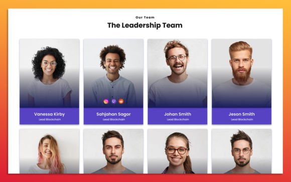
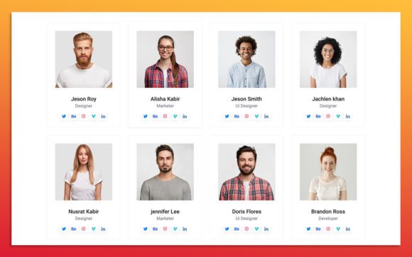
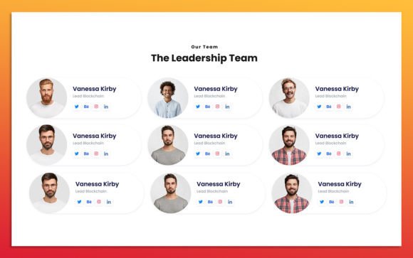
The 15 Team Member UI Elements are not merely static images; they are fully editable, vector-based components built in Figma. The primary distinction of this kit lies in its balance between variety and uniformity. It provides fifteen unique layouts that cover the most common presentation styles used in contemporary web design, including grid views, horizontal lists, circular avatars, and card-based structures.
Each element is designed with a focus on modularity. The layers are fully organized, meaning that every text field, image placeholder, and icon is named logically and grouped appropriately. This structure is crucial for professional workflows where multiple designers might collaborate on a single file. The use of Google Fonts ensures that typography remains consistent and widely accessible, while the clean, modern aesthetic allows these elements to blend seamlessly into various brand identities without requiring extensive redesign.
Customization and Scalability in Figma
One of the most significant advantages of using a dedicated UI kit like this is the ability to scale designs efficiently. In traditional web design workflows, changing a color scheme or updating a font family across multiple team member cards could take hours. With the 15 Team Member UI Elements, these changes are streamlined through Figma’s component properties and styles.
The kit supports 100% scalability. Because the elements are vector-based, they retain their sharpness regardless of the display size, from mobile screens to large desktop monitors. This responsiveness is baked into the design logic, allowing designers to preview how a team widget will look on different devices without manually resizing every element. Furthermore, the ability to easily change color styles means that adapting the widgets to match a corporate brand guide is a matter of swapping style variables rather than recoloring individual shapes.
For those who prioritize speed without sacrificing quality, the pre-built nature of these widgets reduces the initial setup time significantly. Instead of starting with a blank canvas, designers begin with a structured foundation that adheres to modern UI principles such as adequate whitespace, readable typography hierarchy, and balanced alignment.
Comparing UI Kits to Custom Design Approaches
When deciding whether to use a pre-made kit like the 15 Team Member UI Elements or to design custom components from scratch, it is essential to weigh the tradeoffs. Custom design offers unlimited creative freedom and ensures that every pixel aligns perfectly with a unique brand vision. However, this approach demands significant time and expertise in layout theory and responsive behavior.
In contrast, using a UI kit provides a standardized starting point. The strength of this approach lies in consistency and speed. For agencies handling multiple client projects, or startups needing to launch a minimum viable product quickly, the efficiency gains are substantial. The limitation, however, is that the designs may feel familiar to users who have encountered similar templates elsewhere. To mitigate this, designers must leverage the customization options—altering colors, spacing, and imagery—to inject unique brand personality into the standard structures.
Another alternative is using coded component libraries directly. While these offer immediate implementation, they often lack the visual flexibility needed during the prototyping phase. A Figma-based UI kit bridges this gap, allowing for rapid visual iteration before any code is written. This makes it an ideal choice for teams that prioritize design validation before development.
Best-Fit Situations and Use Cases
The 15 Team Member UI Elements are particularly well-suited for specific types of projects. Corporate websites, consulting firms, and digital agencies often require professional, clean presentations of their staff. The simple and modern design language of these widgets aligns well with industries that value transparency and professionalism.
E-commerce platforms featuring artisan creators or small business owners can also benefit from these elements. The variety of fifteen different layouts allows for diverse presentation styles within the same site. For instance, a homepage might feature a compact horizontal list of key leadership, while a dedicated "Our Story" page could utilize larger, more detailed card layouts with biographical text.
Additionally, these elements are useful for educational institutions or non-profits where showcasing board members or volunteers is common. The ease of updating images and text means that personnel changes can be reflected in the design files quickly, ensuring that marketing materials remain current without requiring a designer to rebuild components from scratch.
Limitations and Decision Factors
While versatile, this UI kit is not a universal solution for every design challenge. If a project requires highly experimental, avant-garde layouts that break conventional grid systems, the structured nature of these elements might feel restrictive. In such cases, a bespoke design approach would be more appropriate.
Another consideration is the depth of interaction design. These UI elements focus on visual presentation. They do not include complex micro-interactions or animated states, which must be designed separately if required. Designers should view these widgets as the static foundation upon which interactive prototypes are built.
Furthermore, while the kit uses Google Fonts, projects requiring proprietary or custom typefaces will need to replace the default fonts. This process is straightforward in Figma but requires attention to detail to ensure line heights and spacing remain harmonious after the font swap.
Making an Informed Choice
Choosing the right resource for your web UI needs depends on your specific constraints and goals. If your priority is rapid prototyping, consistent styling, and ease of handoff to developers, the 15 Team Member UI Elements offer a compelling solution. The fully organized layers and scalable vector graphics reduce technical debt in the design phase, allowing teams to focus on content strategy and user experience rather than pixel-pushing.
However, if your brand identity relies heavily on unique, non-standard visual metaphors, you may find that these elements require significant modification to fit your vision. In such scenarios, evaluate whether the time saved by using the kit outweighs the time spent customizing it to look unique.
Ultimately, the value of this UI kit lies in its practicality. It serves as a robust toolkit for professionals who need reliable, clean, and modern team presentation options. By providing a solid structural base, it empowers designers to iterate faster and deliver polished results. Whether you are refreshing an existing website or building a new digital presence, understanding the capabilities and limitations of such tools enables you to make smarter, more efficient design decisions.
For those exploring alternatives, consider comparing this kit with other specialized Figma resources that focus on different aspects of web design, such as navigation bars or footers. Integrating a cohesive set of UI elements from a single source often results in a more harmonious final product than mixing disparate components from various libraries. The key is to assess how well the 15 Team Member UI Elements align with your broader design system and workflow preferences.